Design question
How can a restaurant website communicate warmth and atmosphere without falling into familiar rustic clichés?
Approach
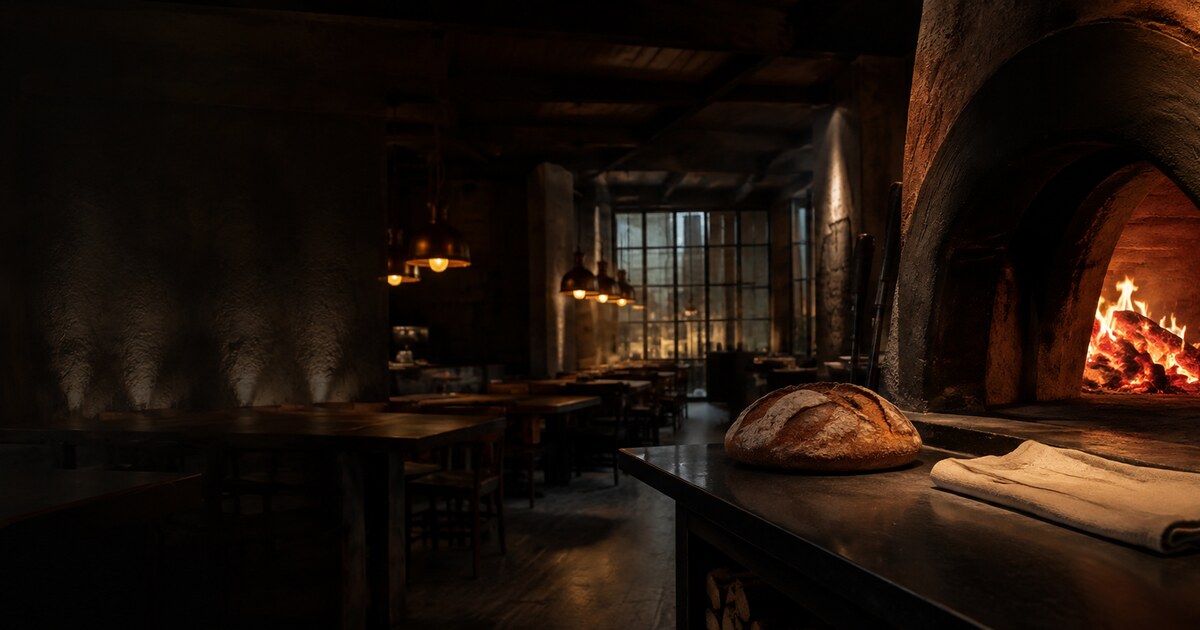
I built the system around dark surfaces, warm orange accents, strong food imagery and generous typography. Menu, story, chef, gallery and event content share one visual rhythm.
Card and button motion was designed as a gradual sense of weight and lift rather than a quick decorative effect. In the navigation, an underline grows from left to right beneath each item, reinforcing direction and continuity.
Outcome
The resulting concept communicates atmosphere through colour, movement, spacing and transitions—not imagery alone.
This is an independent concept study and makes no claims of client results or commercial performance.